


What started as a traditional telecom app became a multi-service digital hub. Customers could manage internet, mobile, TV, devices, and personalized offers in one place. But the growth created friction. Navigation became complex. Screens overlapped. Key features were difficult to find.
The app needed more than visual updates. It required a structured product design approach grounded in user research and clear UX design principles.
The Challenge
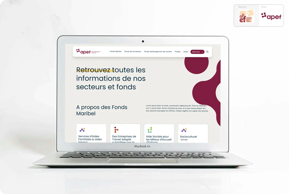
After the rebranding from their old version to the new one, our client’s app expanded rapidly. New services were added. Features multiplied. Tabs overlapped.
User feedback revealed three recurring issues:
- Redundant navigation between “Products” and “Home Experience”
- Difficulty locating core telco functions
- Inconsistent interaction patterns across screens
Users struggled to manage or diagnose their services. Drop-offs increased. Engagement slowed. The interface did not reflect the ambition of the brand.
The goal was clear: redesign the navigation architecture and improve clarity before launching an MVP in May.
This meant working within technical constraints while redefining the structure of the app.
Our Approach
We approached this redesign as a full product design mission. It combined user research, UX design, and structured collaboration across squads.
1. User Research and Discovery
We conducted 28 user interviews and multiple research cycles to understand behaviors and friction points.
Our user research included:
- Qualitative interviews
- Unmoderated user tests
- Open card sorting
- Tree testing
- Heatmap analysis
- Concept validation sessions
We measured navigation findability and observed where users hesitated or abandoned tasks.
This research shaped the new information architecture.
2. Redefining the Navigation Architecture
The core decision was structural.
We merged the former “Products” and “Home Experience” tabs into a single entry point: the Product Tab.
We introduced a three-level hierarchy:
- Level 1: Product Tab (main entry point)
- Level 2: Overview pages
- Level 3: Detailed product dashboards (Internet, Mobile, TV, Modem)
This eliminated redundant screens and clarified user pathways.
To reduce cognitive load, we applied progressive disclosure. Users see only what is relevant at each stage of their journey.
We also introduced a modular navigation system:
- Bottom tab bar for core actions
- Contextual shortcuts for secondary actions
Visual hierarchy and color contrast guide attention toward priority actions.
3. UX Design, Prototyping, and Iteration
All UX design flows were translated into high-fidelity UI layouts aligned with our client’s Design System.
We:
- Built user flows and sitemaps
- Created wireframes and interactive prototypes
- Conducted usability tests on individual tabs
- Iterated based on measurable findings
- Validated accessibility standards
Bi-weekly design critiques ensured consistency with the Core team guidelines.
We worked closely with product owners, developers, and multiple tribes (Design Ecosystem, IVM, Omnicare, RES) to align business objectives and technical feasibility.
This collaboration ensured that the MVP preserved existing functionality while introducing a new structure.
The Result:
The redesigned Product Tab became the single control center for managing telco services.
It now includes:
- Product dashboards with real-time monitoring
- Proactive anomaly detection
- Quick shortcuts (manage devices, run speed tests)
- Integrated product catalog and personalized offers
The impact was measurable.
- 25–30% increase in task completion rates
- +20% rise in daily active users
- Improved navigation findability scores (toward 4.0+)
- Reduced navigation time
- Higher satisfaction in usability tests
Clearer architecture reduced confusion. Simplified navigation improved onboarding. Accessibility improvements supported broader adoption.
Beyond UX metrics, the redesign supported the telco company’ digital strategy. The app moved closer to becoming a centralized multi-service hub.
Product Design as a Strategic Lever
This case illustrates how structured Product Design, grounded in user research and disciplined UX design, can reshape a digital product without disrupting delivery timelines.
We:
- Led research cycles end to end
- Defined new information architecture
- Designed scalable UI aligned with a design system
- Ensured accessibility compliance
- Delivered within MVP constraints
At the Strategy, Product & Transformation service line of CBTW, we treat Product Design as a business discipline. Research informs structure. Structure supports clarity. Clarity drives measurable results. When navigation improves, engagement follows. When UX design aligns with real user behavior, digital products perform better—both for users and for the business.
Contact us to discuss how we can help you.